Website examples

Two concepts.
Two distinct approaches.

A garden care business and a skincare studio: see how structure, imagery and typography can suit different kinds of business.

01 / One-page website

Hain & Hof

Original Kernport concept · fictional business
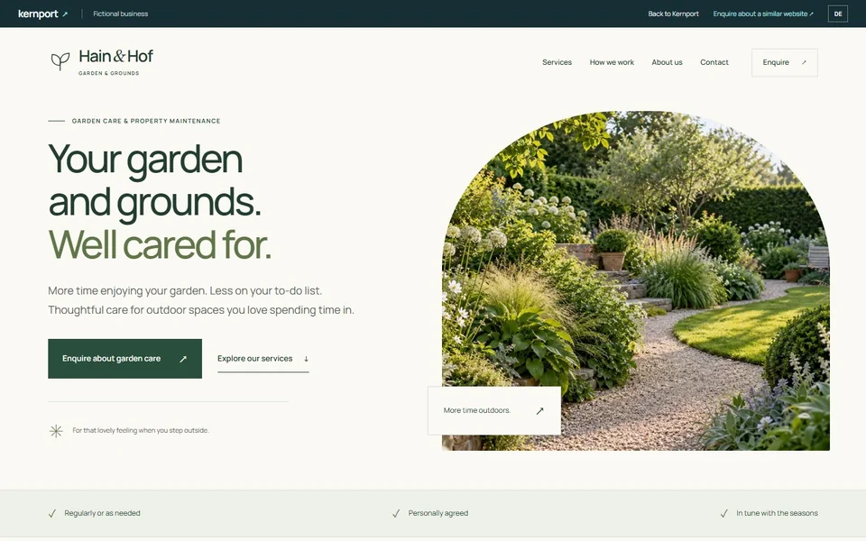
English Hain & Hof example website with a large green headline and garden imagery
Desktop · opening view
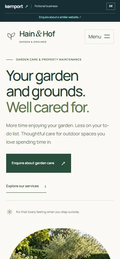
English Hain & Hof mobile opening with a large headline, vertically arranged actions and garden imagery below
Phone · opening view

The brief and the structure

A garden care business needs to answer a few questions quickly: what is offered, how does the work happen, and how do visitors get in touch?

Hain & Hof brings three service areas, a short introduction, a three-step approach and an illustrative service area together on one page. Navigation jumps to the relevant section; “Explore our services” leads from the introduction to the offer.

Design and the mobile view

Large, clear type and natural greens give the content a calm setting. Garden imagery provides a focal point, while fine rules separate services and the approach without needing extra pages.

On a phone, the text and garden image stack vertically. The introductory actions sit on separate lines, and a menu opens the section navigation.

02 / Multi-page website

Studio Stillraum

Original Kernport concept · fictional business
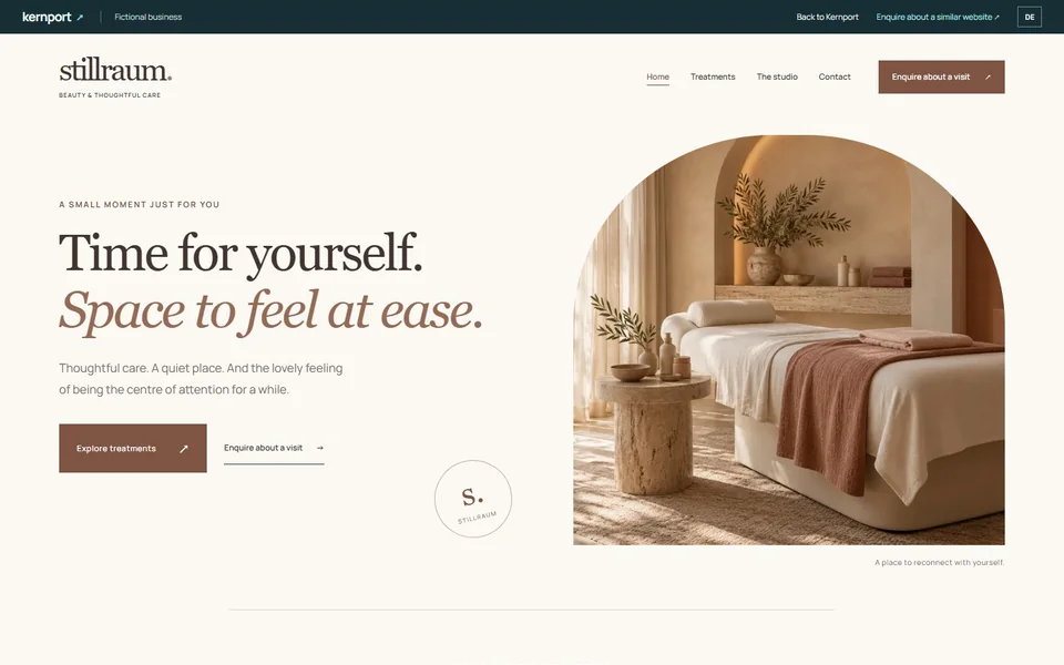
English Studio Stillraum example website with serif typography and a treatment room in warm natural tones
Desktop · opening view
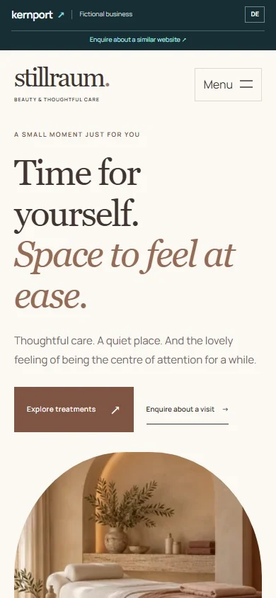
English Studio Stillraum mobile opening with serif type, contact actions and room imagery below the introduction
Phone · opening view

The brief and the structure

A skincare studio wants to convey its atmosphere while leaving room to explain different treatments and introduce the studio itself.

The home page gives an overview. Separate pages explain facial care, brows and lashes, and hand care, introduce the fictional studio’s approach and set out how an enquiry would work. Main navigation connects these four pages.

Design and the mobile view

Warm natural tones, generous imagery and serif type give this website a different character from the garden example. Repeated contact actions lead visitors from the content pages to a next step.

On a phone, the room image follows the introduction. Content and treatment cards stack vertically; a menu keeps all four pages accessible without crowding the opening with links.

One page or several?

One connected overview

As Hain & Hof shows, one page can work well when services, the approach and contact details stay concise. Visitors can follow the page or jump straight to a section.

Room for individual topics

As Studio Stillraum shows, separate pages help when services need more explanation or the business and contact journey deserve their own space. Each page has a clear focus.

We choose a suitable approach around your content and goals. Extra pages, languages and special features are discussed first.

Contact actions in the demos illustrate a possible journey. They do not send messages or book appointments.

Your plans can be different.

These are design directions, not complete packages offered at the minimum price. Tell me what your website should show. We agree the scope, content, features and final creation price individually.